KanariCX: Mobile Survey Experience
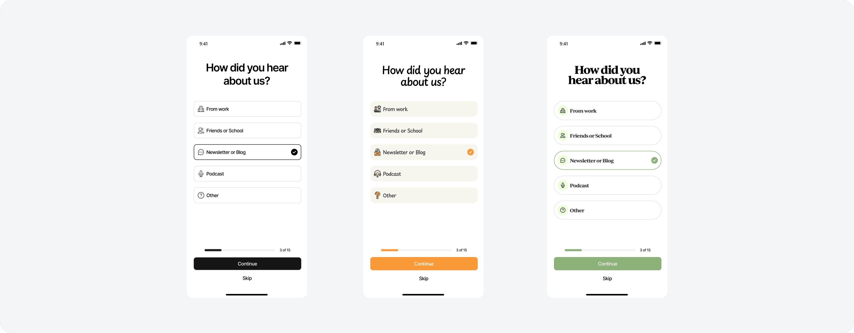
KanariCX powers post-service surveys for organisations measuring customer and employee experience. I redesigned the mobile survey-taking experience from the ground up, and built the customisation system behind it that lets every survey carry the sending brand, not Kanari's.
Year
2025
Role
Product Designer
Scope
Mobile UX, Dashboard Tooling, UI
context
Kanari helps organisations turn customer and employee feedback into actionable insights. Its platform brings measurement, monitoring, and analytics together to help businesses understand experiences, identify opportunities, and drive meaningful improvement.

Problem
A survey that was never actually designed for mobile.
The existing survey was essentially a desktop web form squeezed onto mobile. Questions stacked on one long page, rating scales were difficult to tap, and NPS packed eleven numbers into a narrow row. With no progress indicator, even five questions felt endless. The experience also lacked brand identity, making every survey look the same.

Investigation
Before redesigning the experience, I needed to understand where friction came from and why users were dropping off. I looked at the experience through three lenses: interaction effort, user behaviour, and brand presence.
Stakeholder & Developer Interviews
I spoke with stakeholders and developers to understand the real-world impact. Three consistent themes came up: Admins were managing agents manually with no structured permission controls. Developers were hard-coding access rules because no design system existed for it. Bringing a new agent onboard meant a full manual briefing on what to avoid touching.
Step 2
Add your second investigation step content here.
Friction Heatmap
The existing mobile survey was analysed screen-by-screen to map friction points across tap precision, visual density, scrolling, progress visibility, and completion effort.
The patterns were consistent. Interaction-heavy moments clustered around rating scales, matrix questions, and long stacked layouts. The survey wasn't long — it felt long.

The goal was simple: reduce effort, increase trust, and make every interaction count.
Text 3
C3 is a B2B omni-channel platform where support and sales teams manage customer conversations across WhatsApp, Messenger, Instagram, and Email from one unified inbox. Three user types. Two separate systems. No defined rules for who could do what.
Text 3
C3 is a B2B omni-channel platform where support and sales teams manage customer conversations across WhatsApp, Messenger, Instagram, and Email from one unified inbox. Three user types. Two separate systems. No defined rules for who could do what.
Any thingxt
C3 is a B2B omni-channel platform where support and sales teams manage customer conversations across WhatsApp, Messenger, Instagram, and Email from one unified inbox. Three user types. Two separate systems. No defined rules for who could do what.
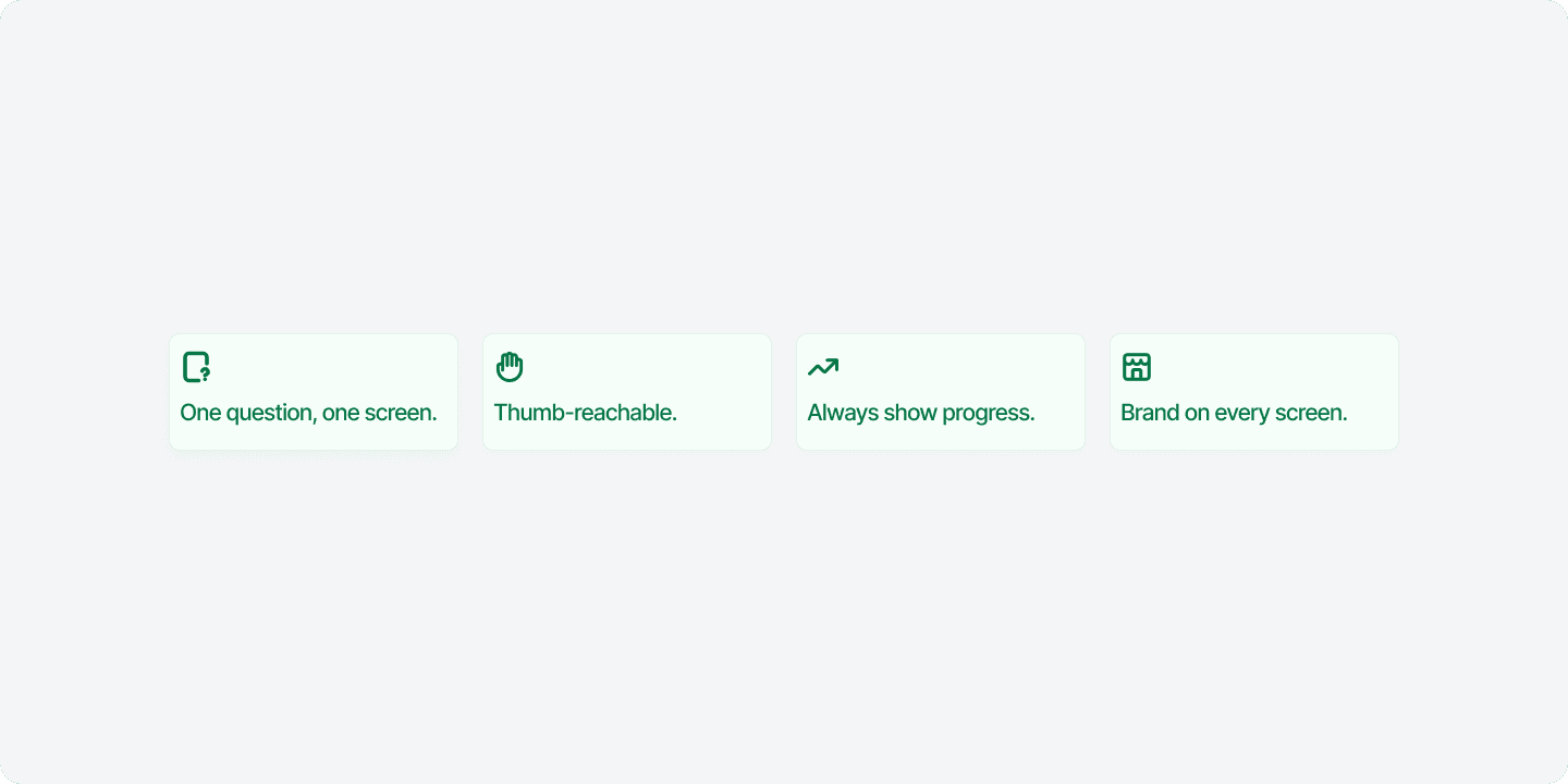
Defining the Mobile Principles
Before exploring layouts or interactions, a clear set of design principles was established to guide every decision throughout the experience. They became the benchmark for evaluating concepts, resolving trade-offs, and maintaining consistency from the first screen to the last.
IMPACT
18% higher mobile completion rate
12% higher response rate in pilot accounts
~40% faster average load time
5 question types redesigned for touch
2× faster survey setup
100% compliant primary touch targets
Reflection
Mobile isn't a smaller version of desktop. The desktop survey wasn't bad, it was simply never designed for the device 90% of people actually used.
Delight isn't decoration when it drives completion. The micro-animations weren't polish for polish's sake, they measurably reduced the perceived effort of finishing.
Validate on the real device, in the real context. The pilot testing on actual phones over actual SMS links surfaced a problem no desktop QA session ever would have caught.