Product Kanari
KanariCX helps businesses create better customer experiences through thoughtful tools that simplify interactions, strengthen relationships, and make every customer journey more seamless.
Problem Arabic needed more than adaptation
The font lacked full Arabic support, requiring refinements to make its letterforms feel natural, balanced, and consistent with KanariCX’s visual identity.
Solution A typeface shaped for Arabic
Refined stroke endings, adjusted stroke thickness, and carefully considered letterforms to create a cleaner, more cohesive typographic experience.
Result Refined Arabic Typography
A more tailored Arabic experience, with customized letterforms, proportions, and spacing designed for Arabic users.
Font editor software: Glyphs
CONTEXT
Beyond the Latin Letterforms.
KanariCX needed an Arabic typographic direction that felt like part of the product, not an afterthought. The challenge was to preserve the typeface’s original character while adapting its details to the structure and rhythm of Arabic.
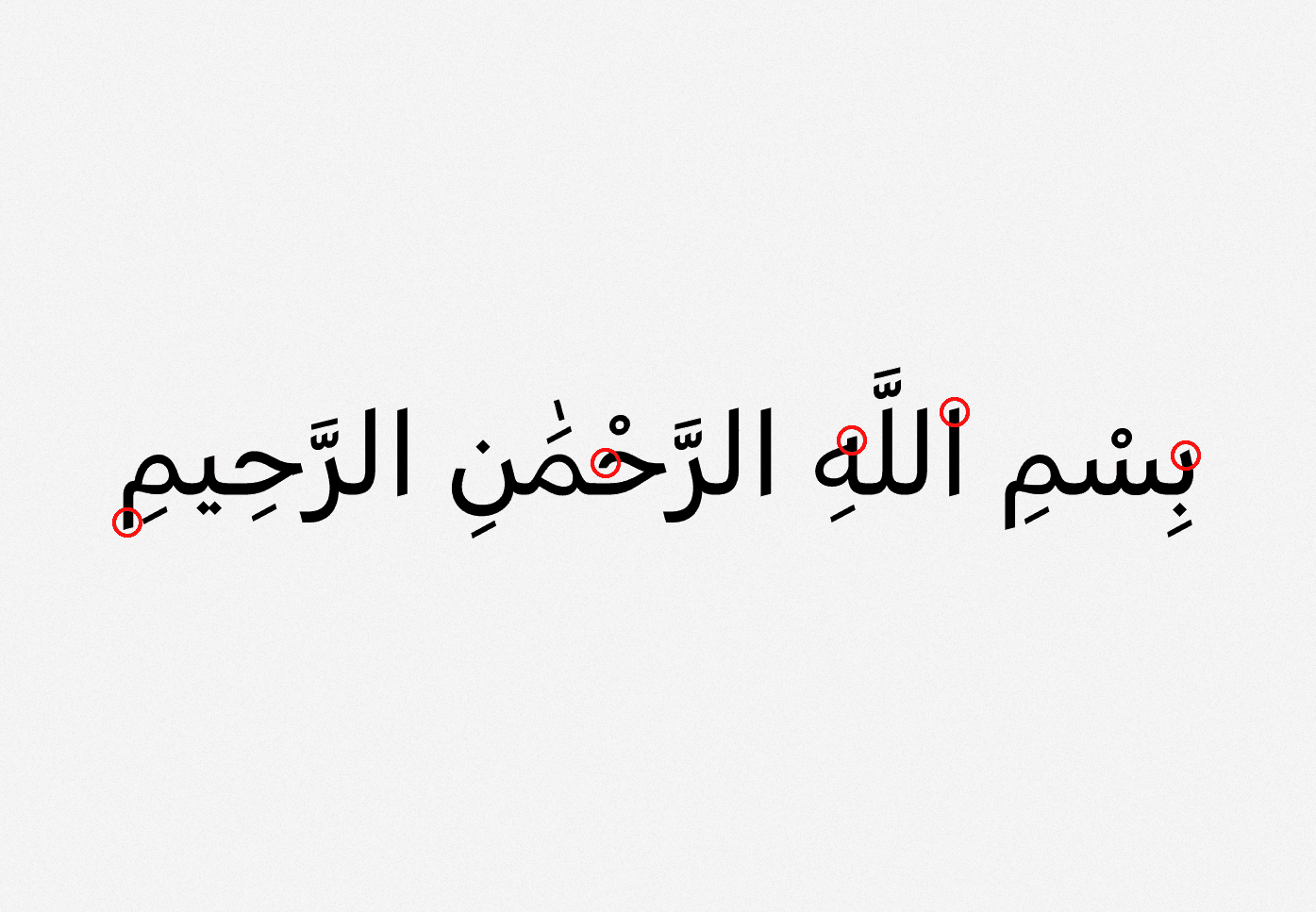
CHANGE 1/4
Terminal Shape
From rounded to sharp.
Changed rounded stroke endings to sharper terminals for a cleaner, more contemporary finish.
DESIGN 2/4
Stroke Modulation
Balancing weight within each letter.
Adjusted stroke thickness in selected letters, introducing subtle variations around corners and curves to improve visual balance.

DESIGN 3/4
Diacritics Design
More complete Arabic diacritics support.
: Replaced the original dot shapes with diamond forms, creating a sharper, more distinctive Arabic style while maintaining visual consistency across letterforms.

DESIGN 4/4
Dot Design
Diamond-shaped dots.
Customer context is surfaced directly within the conversation, giving users a quick view of who they are speaking with, along with relevant information and actions, without forcing them into a separate screen.

In a screen… it looks like this.
